Emerging Futures
Sectors
- Health and Social Care
Disciplines
- Branding and Identity
- Filmmaking
- Graphic Design
- Web Design
- Web Development
Visit the website
A Positive Ripple Effect.
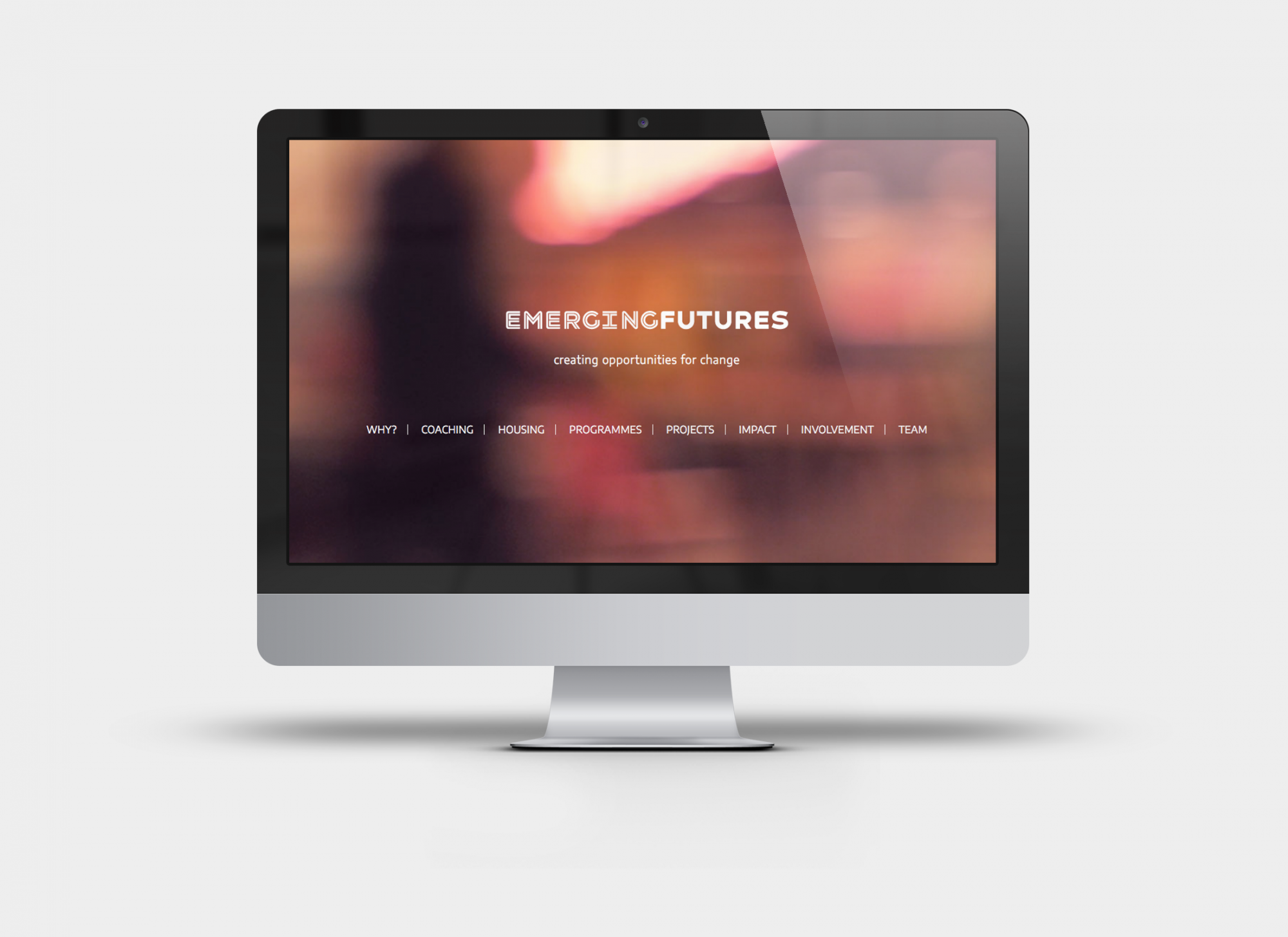
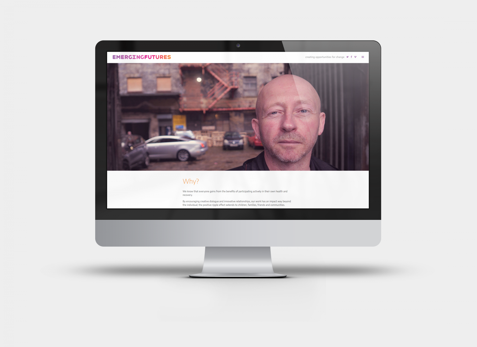
We identified that video content was going to be key to talk directly to potential commissioners through the website and social media. The next decision we made was radical. We created the video content not just before the identity but used it to help us understand the work and inform the concept, it worked a treat. We filmed both the people who EF work with and staff and volunteers, who all shared their stories. The core message projected from the videos was one of personal and organisational pride, both in the dramatic journeys people are on and the journeys they had made.
KIND. centred our work around a typeface called Havelock, it combines hard and soft aspects, which reflects the caring and disciplined nature of EF’s work. The in-line version used for emerging has parallel lines which is a visual nod to the original logo. This version also has a neon type drama to it that is rare to find in an uncomplicated sans serif font, it has a hero quality that is uncompromising and proud, qualities that loomed large in the stories we filmed.
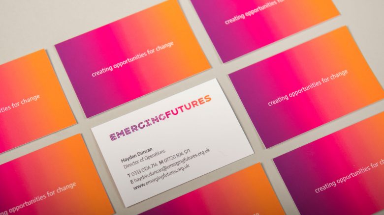
The colour palette we loved from the start was a rainbow gradient. It is a perfect way of addressing the core values of momentum, change and diversity. The purple is associated with recovery, the magenta and orange are associated with warmth and passion.
The new identity has had a profoundly positive impact on EF’s internal culture and self image. It has also sped-up and deepened commissioners’ understanding of EF’s dramatic impact on individuals, families and the wider community. We are really proud to have been part of the Emerging Futures journey and look forward to supporting them through more ambitious growth.