Ray Jenkins
Thinkaction
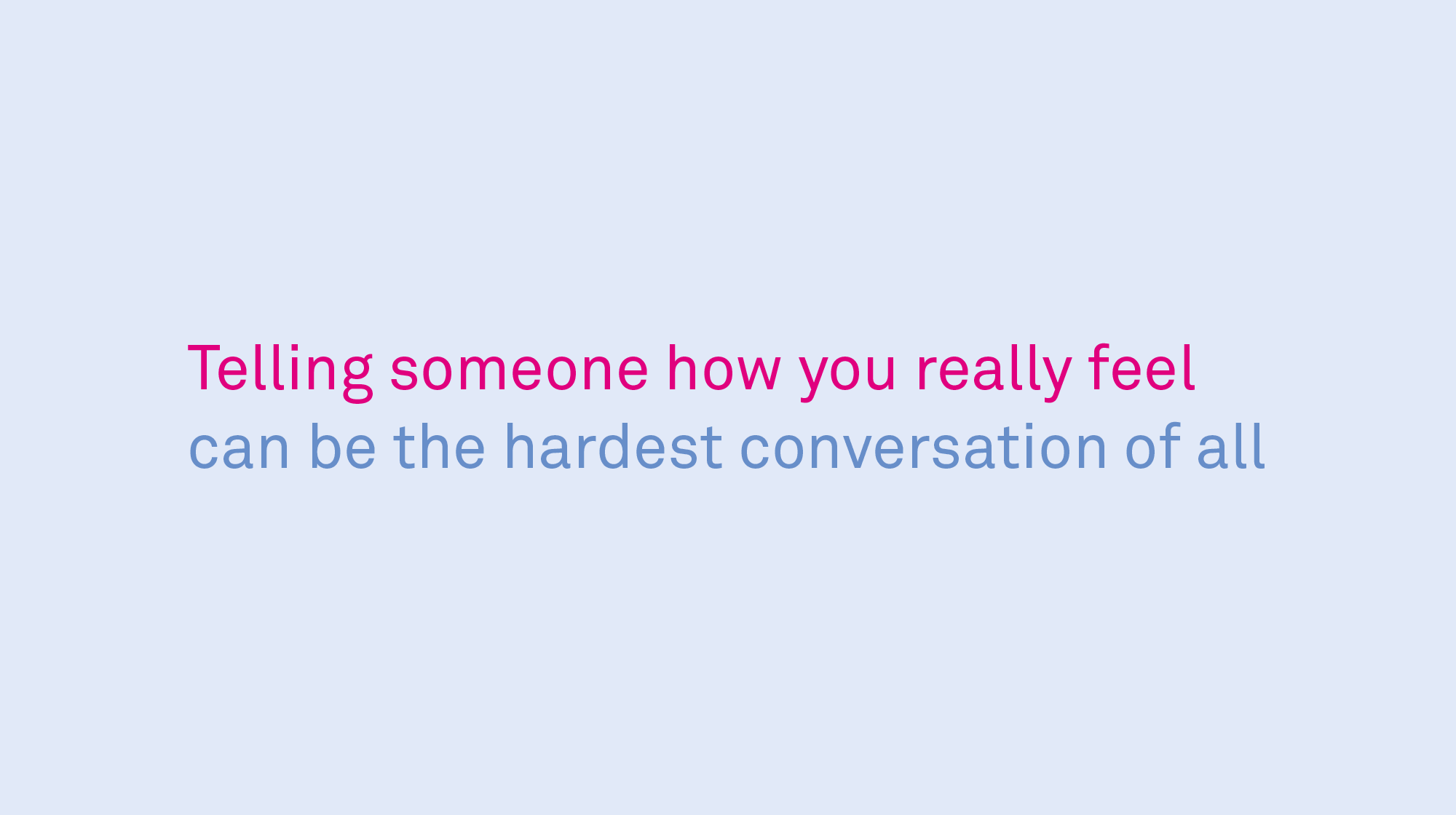
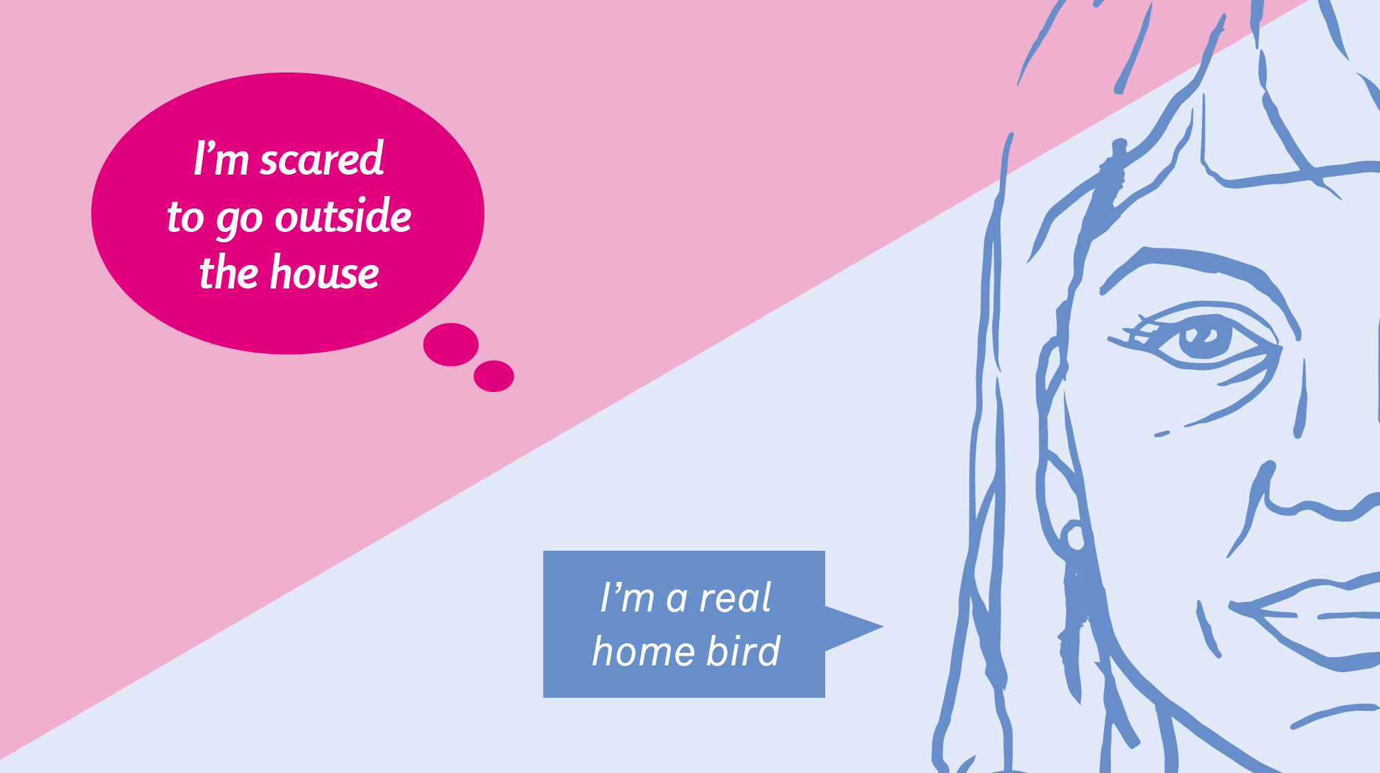
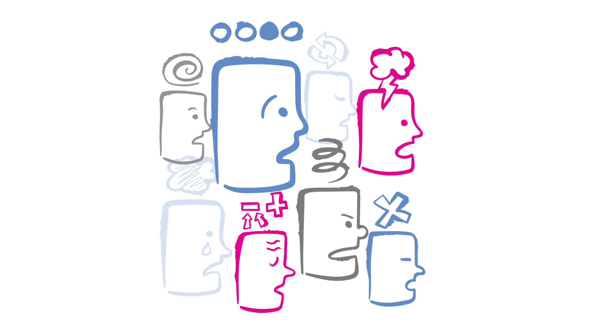
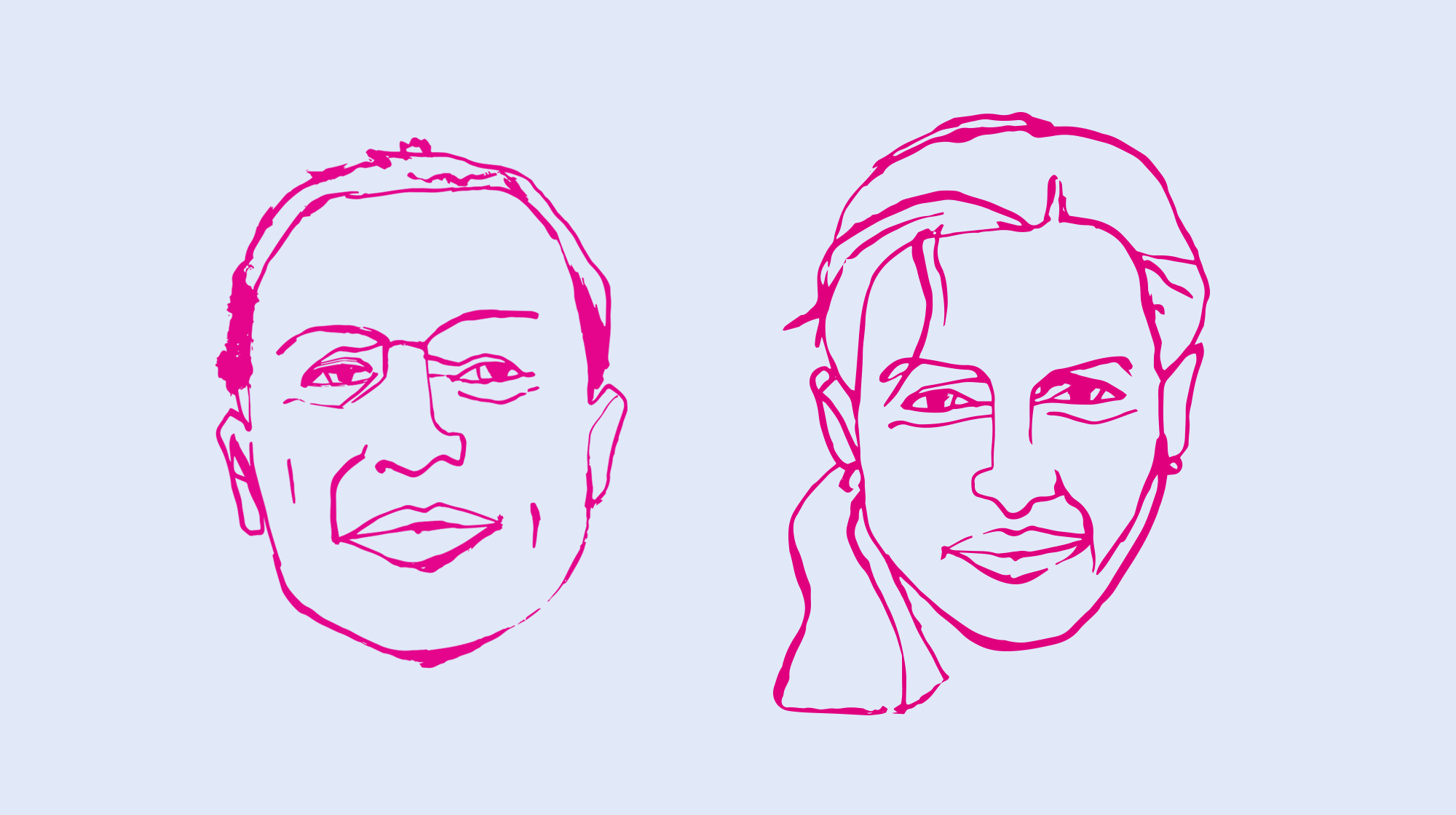
KIND. used the visual symbols of the speech and thought bubble to convey the difference between what we say and think. Bespoke illustrations were created and the designs divided into two halves, to further express the division between what we say and feel. This concept was applied to posters, fliers and social media animations.
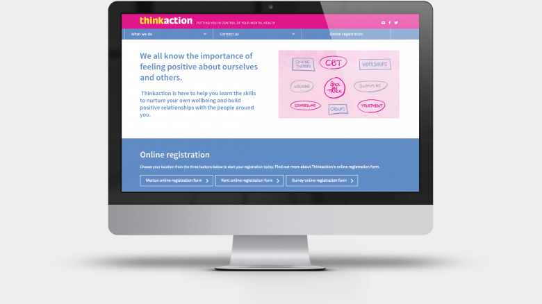
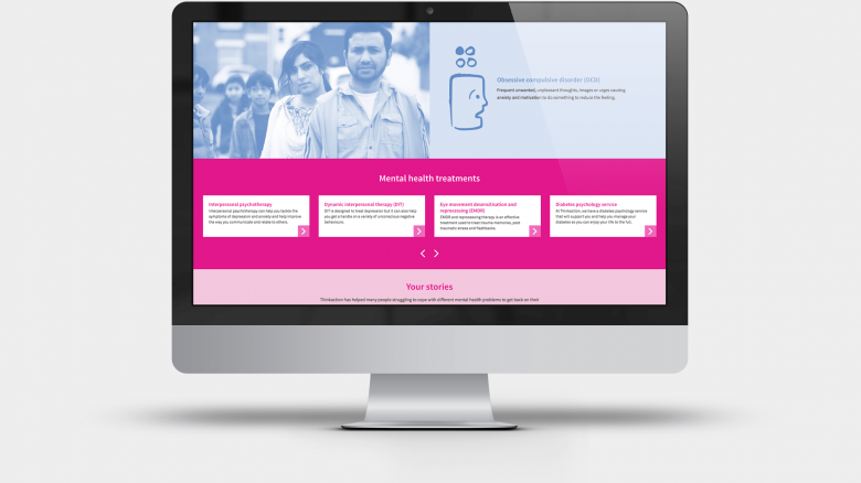
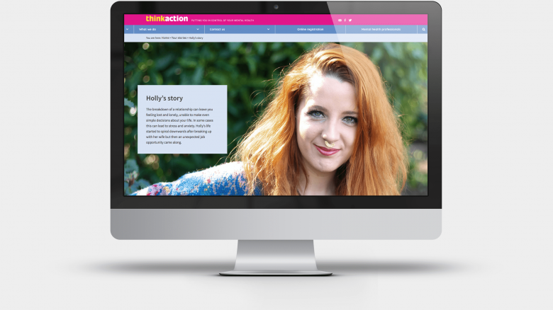
A new strap-line (putting you in control of your mental health), website, animation, films and illustration style were also developed to promote and develop the Thinkaction brand and also help people struggling with mental health issues feel like themselves again. Three videos were created for specific mental health problems. Practitioners from Thinkaction spoke about the signs and symptoms of these issues and offered self-help advice to help people to manage their emotional wellbeing.

Emerging Futures
Emerging Futures
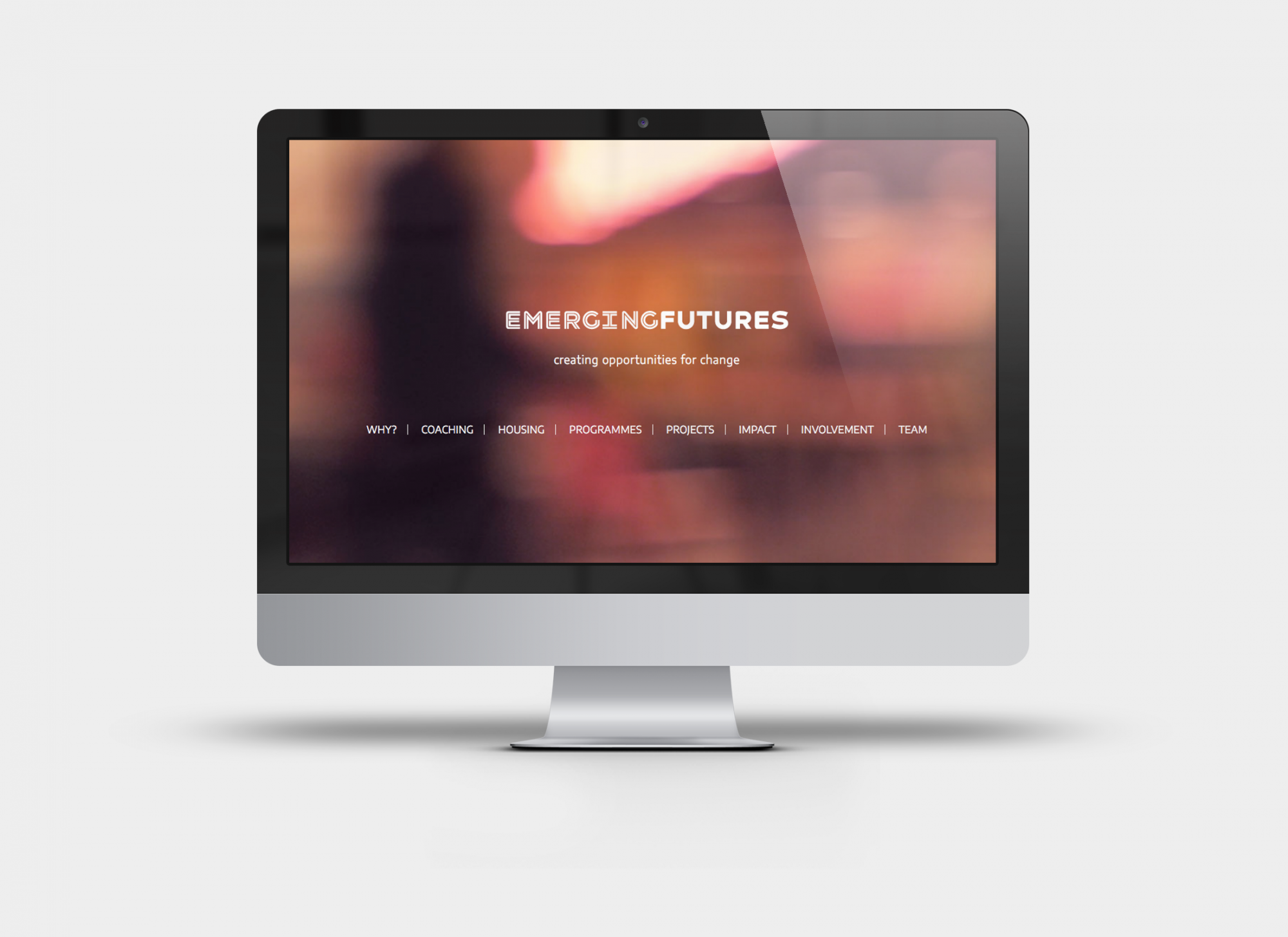
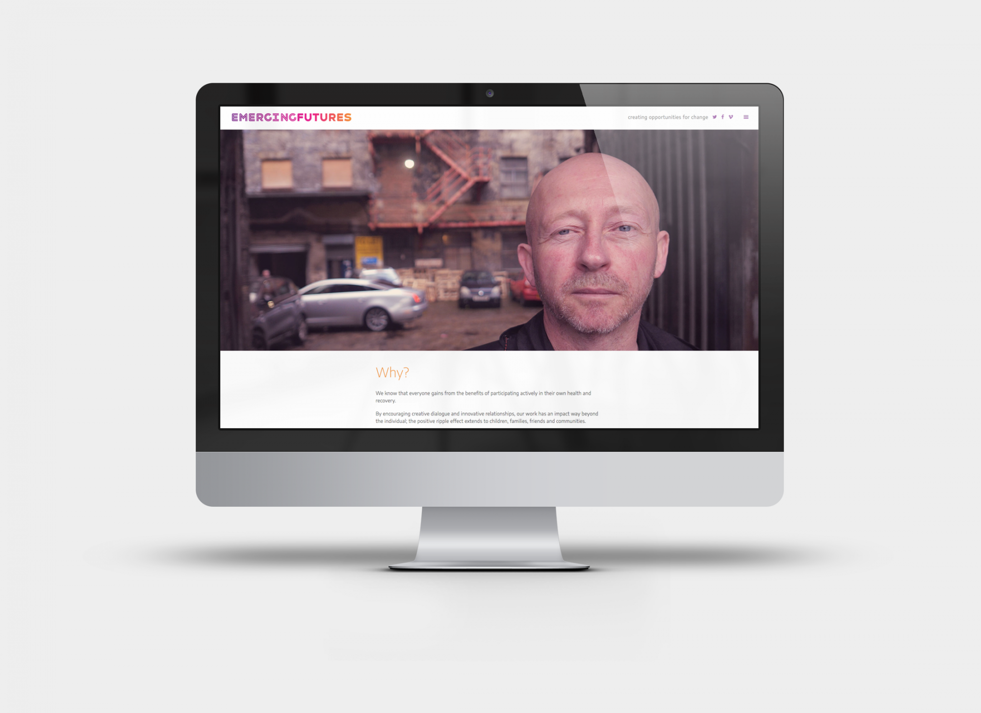
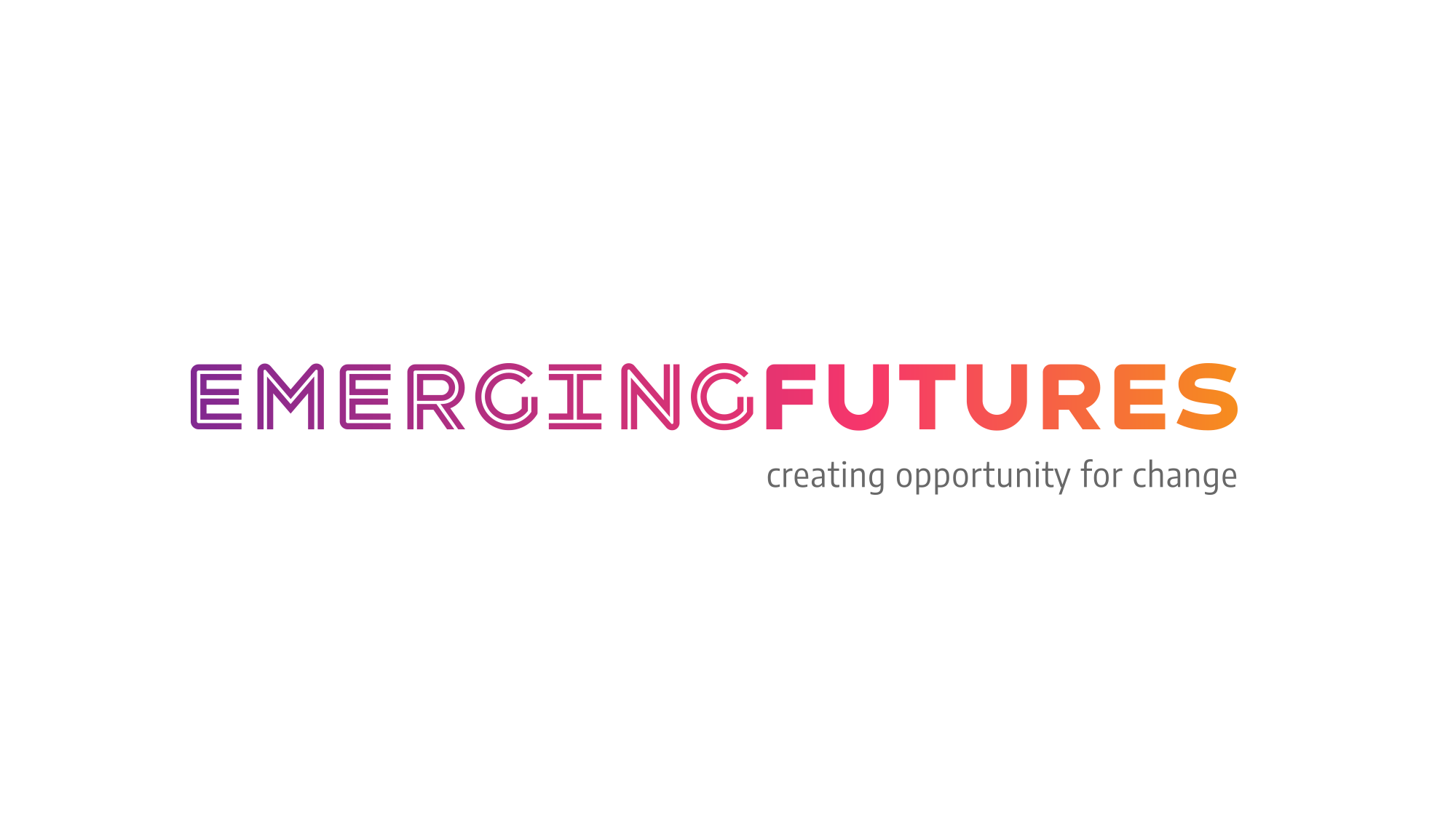
KIND. centred our work around a typeface called Havelock, it combines hard and soft aspects, which reflects the caring and disciplined nature of EF’s work. The in-line version used for emerging has parallel lines which is a visual nod to the original logo. This version also has a neon type drama to it that is rare to find in an uncomplicated sans serif font, it has a hero quality that is uncompromising and proud, qualities that loomed large in the stories we filmed.
The colour palette we loved from the start was a rainbow gradient. It is a perfect way of addressing the core values of momentum, change and diversity. The purple is associated with recovery, the magenta and orange are associated with warmth and passion.
The new identity has had a profoundly positive impact on EF’s internal culture and self image. It has also sped-up and deepened commissioners’ understanding of EF’s dramatic impact on individuals, families and the wider community. We are really proud to have been part of the Emerging Futures journey and look forward to supporting them through more ambitious growth.

